


下面小编就为大家带来一篇CSS实现Tab布局的简单实例(必看)。小编觉得挺不错的,现在就分享给大家,也给大家做个参考。一起跟随小编过来看看吧
一、布局方式
1、内容与tab分离
     内容1
     内容2
     内容3
     内容4
ul,li{
margin:0;
padding:0;
list-style:none;
}
.container{
width:400px;
height:300px;
background-color:silver;
}
.tab-content{
width:100%;
height:80%;
overflow:hidden;
}
.tab-content .item{
width:100%;
height:100%;
}
.tab-control{
width:100%;
height:20%;
}
.tab-control ul{
height:100%;
}
.tab-control li{
width:25%;
height:100%;
float:left;
border:1px solid silver;
box-sizing:border-box;
background-color:white;
cursor: pointer;
}
.tab-control li:hover{
background-color:#7b7474
}
.tab-control a{
display:inline-block;
width:100%;
height:100%;
line-height:100%;
text-align:center;
text-decoration: none;
}
.tab-control a::after{
content:"";
display:inline-block;
height:100%;
vertical-align:middle;
}
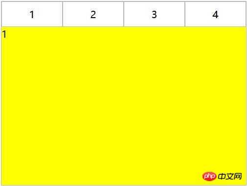
.tab-content .item:target{
background:yellow;
}
2、内容与tab一体
Modoer 是一款以本地分享,多功能的点评网站管理系统。采用 PHP+MYSQL 开发设计,开放全部源代码。因具有非凡的访问速度和卓越的负载能力而深受国内外朋友的喜爱,不局限于商铺类点评,真正实现了多类型的点评,可以让您的网站点评任何事与物,同时增加产品模块,也更好的网站产品在网站上展示。Modoer点评系统 2.5 Build 20110710更新列表1.同步 旗舰版系统框架2.增加 限制图片
-
1
1
-
2
2
-
3
3
-
4
4
ul,li,p{
  margin:0;
  padding:0;
  list-style:none;
}
.container{
  width:400px;
  height:300px;
  background-color:silver;
  border:1px solid silver;
}
.container ul{
  width:100%;
  height:100%;
  overflow:hidden;
}
.container .item{
  float:left;
  width:25%;
  height:100%;
  background-color:white;
}
.container .item .title{
  line-height:40px;
  border:1px solid silver;
  box-sizing:border-box;
  text-align:center;
  cursor:pointer;
}
.container .item .content{
  width:400%;
  height:100%;
  background-color:yellow;
}
.ml1{
  margin-left:-100%;
}
.ml2{
  margin-left:-200%;
}
.ml3{
  margin-left:-300%;
}
.active{
  position:relative;
  z-index:1
}
.container .item:hover{
  position:relative;
  z-index:1
}
.container .item:hover .title{
  border-bottom:none;
  background-color:yellow;
}
利用负margin,将内容区对齐,然后内容去添加背景色,避免不同tab对应的区域透视重叠。
二、CSS实现交互
立即学习“前端免费学习笔记(深入)”;
1、锚点实现(target)
(1)针对布局一:item从上往下排列,父元素tab-content加上overflow:hidden。利用锚点,点击不同a标签的时候,具有对应ID的item会切换到tab-content的视图中,然后利用hover给tab按钮加上切换样式。
     内容1
     内容2
     内容3
     内容4
ul,li{
  margin:0;
  padding:0;
  list-style:none;
}
.container{
  width:400px;
  height:300px;
  background-color:silver;
}
.tab-content{
  width:100%;
  height:80%;
  overflow:hidden;
}
.tab-content .item{
  width:100%;
  height:100%;
}
.tab-control{
  width:100%;
  height:20%;
}
.tab-control ul{
  height:100%;
}
.tab-control li{
  width:25%;
  height:100%;
  float:left;
  border:1px solid silver;
  box-sizing:border-box;
  background-color:white;
  cursor: pointer;
}
.tab-control li:hover{
  background-color:#7b7474
}
.tab-control a{
  display:inline-block;
  width:100%;
  height:100%;
  line-height:100%;
  text-align:center;
  text-decoration: none;
}
.tab-control a::after{
  content:"";
  display:inline-block;
  height:100%;
  vertical-align:middle;
}
上述方法只是利用了锚点切换,没有使用:target。修改CSS
ul,li{
  margin:0;
  padding:0;
  list-style:none;
}
.container{
  width:400px;
  height:300px;
  background-color:silver;
}
.tab-content{
  position:relative;
  width:100%;
  height:80%;
  overflow:hidden;
}
.tab-content .item{
  position:absolute;
  left:0;
  top:0;
  width:100%;
  height:100%;
}
.tab-control{
  width:100%;
  height:20%;
}
.tab-control ul{
  height:100%;
}
.tab-control li{
  width:25%;
  height:100%;
  float:left;
  border:1px solid silver;
  box-sizing:border-box;
  background-color:white;
  cursor: pointer;
}
.tab-control li:hover{
  background-color:#7b7474
}
.tab-control a{
  display:inline-block;
  width:100%;
  height:100%;
  line-height:100%;
  text-align:center;
  text-decoration: none;
}
.tab-control a::after{
  content:"";
  display:inline-block;
  height:100%;
  vertical-align:middle;
}

.tab-content .item:target{
  z-index:1;
  background-color:yellow;
}item使用绝对定位,然后使用:target修改元素z-index达到切换效果(其实也可以通过控制元素的display来达到切换效果)
(2)针对布局二:
ul,
li,
p {
  margin: 0;
  padding: 0;
  list-style: none;
}

.container {
  width: 400px;
  height: 300px;
  background-color: silver;
  border: 1px solid silver;
}

.container ul {
  width: 100%;
  height: 100%;
  overflow: hidden;
}

.container .item {
  float: left;
  width: 25%;
  height: 100%;
  background-color: white;
}

.container .item .title {
  line-height: 40px;
  border: 1px solid silver;
  box-sizing: border-box;
  text-align: center;
  cursor: pointer;
}
.container .item a {
  display:inline-block;
  width:100%;
  height:100%;
  text-decoration: none;
}

.container .item .content {
  width: 400%;
  height: 100%;
  background-color: yellow;
}

.ml1 {
  margin-left: -100%;
}

.ml2 {
  margin-left: -200%;
}

.ml3 {
  margin-left: -300%;
}

.active {
  position: relative;
  z-index: 1
}

.container .item:target {
  position: relative;
  z-index: 1
}

.container .item:target .title {
  border-bottom: none;
  background-color: yellow;
}
2、hover实现
(1)针对布局一:
无法简单的通过CSS实现
(2)针对布局二:
-
1
1
-
2
2
-
3
3
-
4
4
ul,li,p{
  margin:0;
  padding:0;
  list-style:none;
}
.container{
  width:400px;
  height:300px;
  background-color:silver;
  border:1px solid silver;
}
.container ul{
  width:100%;
  height:100%;
  overflow:hidden;
}
.container .item{
  float:left;
  width:25%;
  height:100%;
  background-color:white;
}
.container .item .title{
  line-height:40px;
  border:1px solid silver;
  box-sizing:border-box;
  text-align:center;
  cursor:pointer;
}
.container .item .content{
  width:400%;
  height:100%;
  background-color:yellow;
}
.ml1{
  margin-left:-100%;
}
.ml2{
  margin-left:-200%;
}
.ml3{
  margin-left:-300%;
}
.active{
  position:relative;
  z-index:1
}
.container .item:hover{
  position:relative;
  z-index:1
}
.container .item:hover .title{
  border-bottom:none;
  background-color:yellow;
}
3、label与:checked实现
(1)针对布局一:
    内容1

    内容2

    内容3

    内容4
ul,
li {
  margin: 0;
  padding: 0;
  list-style: none;
}

.container {
  width: 400px;
  height: 300px;
  background-color: silver;
}

.tab-content {
  position: relative;
  width: 100%;
  height: 80%;
  overflow: hidden;
}

input {
  margin: 0;
  width: 0;
}

.tab-content .item {
  position: absolute;
  left: 0;
  top: 0;
  width: 100%;
  height: 100%;
}

.tab-control {
  width: 100%;
  height: 20%;
}

.tab-control ul {
  height: 100%;
}

.tab-control li {
  width: 25%;
  height: 100%;
  float: left;
  border: 1px solid silver;
  box-sizing: border-box;
  background-color: white;
}

.tab-control li:hover {
  background-color: #7b7474
}

.tab-control label {
  display: inline-block;
  width: 100%;
  height: 100%;
  line-height: 100%;
  text-align: center;
  text-decoration: none;
  cursor: pointer;
}

.tab-control label::after {
  content: "";
  display: inline-block;
  height: 100%;
  vertical-align: middle;
}
.tab-content .radio-item{
  display:none;
}
.tab-content .radio-item:checked+.item {
  z-index: 1;
  background-color: yellow;
}利用css :checked与+(选择紧接在另一个元素后的元素,而且二者有相同的父元素)选择符。
(2)针对布局二:
-
1
-
2
-
3
-
4
ul,li,p{
  margin:0;
  padding:0;
  list-style:none;
}
.container{
  width:400px;
  height:300px;
  background-color:silver;
  border:1px solid silver;
}
.container ul{
  width:100%;
  height:100%;
  overflow:hidden;
}
.container .item{
  float:left;
  width:25%;
  height:100%;
  background-color:white;
}
.container .item .title{
  display:inline-block;
  width:100%;
  line-height:40px;
  border:1px solid silver;
  box-sizing:border-box;
  text-align:center;
  cursor:pointer;
}
.container .item .content{
  position:relative;
  width:400%;
  height:100%;
  background-color:yellow;
}
.ml1{
  margin-left:-100%;
}
.ml2{
  margin-left:-200%;
}
.ml3{
  margin-left:-300%;
}
.radio-item{
  display:none;
}
.radio-item:checked~.title{
  background-color:yellow;
  border-bottom:none;
}
.radio-item:checked~.content{
  background-color:yellow;
  z-index:1;
} 


